Writing for Infographics

Written by Olivia Kingsley
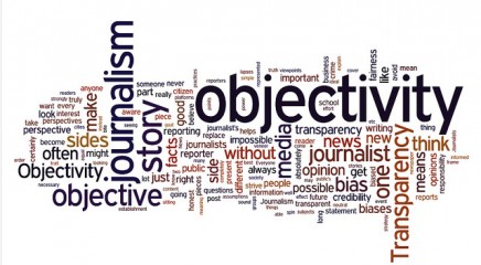
Infographics are popular for good reason. Like a tweet or a vine, they’re self-contained, easily sharable and visually compelling. When done well, they offer a refreshing, clear angle on a subject that readers are curious about.
Although infographics originated in news publications and magazines, many companies now see the advantage of telling stories through design. For publishers and companies it’s a win-win: publishers get high-quality content that draws attention to their site and companies get the opportunity to demonstrate thought leadership in their industry. But if you make a thoughtless infographic, your tactic can backfire and you risk damaging your brand’s reputation.
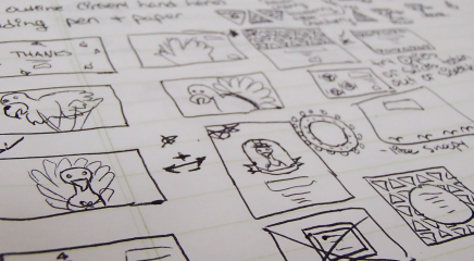
The Recipe for a Great Infographic: Content First, Then Design
Content always comes first. It’s tempting to want to come up with innovative illustrations and visualizations straight away, but content gives your infographic meaning and structure. Many of the terrible infographics lurking around the net suffer from bad content. Bad content leads to bad design, which leads to…your infographic ending up on a “bad infographics” list. Ouch.
Here’s how to make a killer infographic and avoid internet infamy.
1. Understand why you’re making the infographic.
Don’t make an infographic simply because it’s hip or you imagine it’s going to go viral. Make one because you have a story to tell and you believe that an infographic is the best way to share that story. Readers will see straight through bad content or a marketing ploy and you’ll lose credibility.
2. Be clear about who your audience is and isn’t.
Infographics can appear just about anywhere. You could find them in a company brochure, an online magazine, or an industry blog, depending on the content. Before you start to write your content, figure out who will consume your infographic. Is it for customers? The general public? Other industry leaders? Know your target group and make sure that you’re speaking to them in a relevant and engaging way and in a tone they’ll appreciate.
3. Refer to rock-solid sources.
Traditionally, infographics have served as a visual representation of quantitative data. Because of this, they often carry the weight of authority to them—an authority that can be easily exploited by writers and designers who want to crank out content and design that hasn’t been carefully considered. Don’t contribute to the glut of misinformation on the web. If you are using data, ensure that the data is accurate and from the original source instead of a unreliable site. For some best practices, check out Visually’s great blog post highlighting what makes sources good and bad.
4. Tell a simple, meaningful story.
The value of an infographic is that the information you’ve researched has been curated and structured to tell a narrative that your audience will get value from. Take the time to understand your topic, but don’t just pour all the information you’ve learned during your research onto one sheet. As you formulate your narrative, look to represent an original, interesting perspective. No one wants to see an infographic on why Americans like bread. (Or maybe they do.)
5. Write the title first.
The title at the top of the infographic is the lede—the thesis of your content and context for the reader as they continue down the page. Like a newspaper headline, a good title is a declaration that hooks the reader with an element of mystery or emotional connection. If your title isn’t immediately understandable, you may want to start your infographic with a short summary paragraph description under the title. Your title may change as you perfect your prose.
6. Write like a reporter.
In general, use active voice and present tense as though what you’re describing is happening right now. The active voice avoids ambiguity and keeps your readers engaged. You might want to use passive voice or past tense if you’re writing an infographic that compares the past and future. Make cuts where your copy is irrelevant to the story you’re trying to tell, and cut liberally. You should use as few words as possible to get your idea across and the copy should never outweigh the graphics. Finally, just when you think you’ve cut it all, let it sit overnight and come back to it to see if there’s anything else you can cut.
The Right Infographic Can Give You a Huge Payoff
Infographics aren’t a magic content bullet. They can take a lot of research and iteration to get just right, and readers, websites and publishers are reluctant to share any old infographic that comes their way.
But if you’re making infographics that are beautiful, useful and well composed, you’ll establish your company or brand as a savvy thought leader. That’s the power of putting your content on a pedestal.