Why Iteration Is a Designer’s Best Friend and Not the Enemy
As a designer, are the words “one more revision” more common in your day-to-day conversations than “hello?” Do you have files labeled “document.final_final 2_FINAL100.psd?” Have you woken up in the middle of the night wondering if you prefer V2 of your design or V4? If you said yes to any of these questions, you are familiar with the trials and tribulations of the iterative process.
Often compared to an oyster polishing stones into pearls or throwing spaghetti at the wall to see what sticks, the iterative process can feel frustrating, arduous and low-value until the special moment when the completed product emerges. But those moments before the final stage of iteration can actually be the most valuable—if you look at them the right way.
Instead of thinking of iteration as the slow process of spinning straw into gold, look at it as a buildup of interesting scenes in a performance that culminate into one show-stopping final act. Each phase is its own delightful moment to challenge yourself in your craft. Also, iteration doesn’t have to happen in a vacuum. Some of the best moments a creative can have are collaborating with other skilled designers or awesome clients.
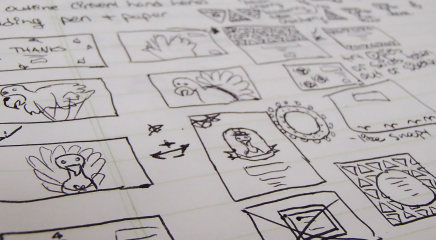
I had just that experience with one of Bhava’s clients while creating a recent infographic. Below is the series of iterations we went through and the techniques I crafted along the way.
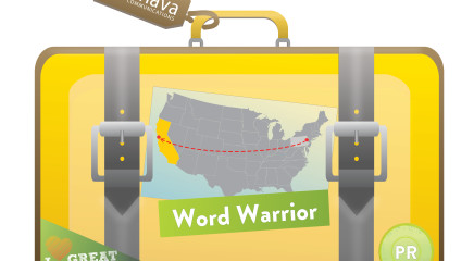
Original sketch

Iteration 1

Iteration 2

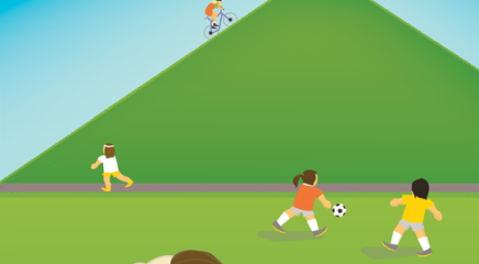
Final

Original sketch to iteration 1
Design focus: balanced typography, illustration of a realistic mountain, usage of 3-D rotate tool in Adobe Illustrator to make the bridge
- • The original idea was to create a Candyland-style graphic, with the statistics and text all on the same plane of the path. It was too constraining. Putting the text and stats in balloons and clouds instead of on the path allowed more freedom to place them within the graphic.
- • The initial composition of the drawing was very zoomed in and we quickly realized that we needed to zoom out to fit all of the information into the frame and still have visible background. Incorporating a big mountain in the foreground in contrast to a smaller mountain in the background created much-needed depth in the illustration once we zoomed out.
Iteration 1 to iteration 2
Design focus: sophisticated use of the gradient and clipping mask tools in Adobe Illustrator
- • The client and our team wanted to build more volume between the ground plane and the sky. We experimented with paragliders in the center to give the illusion of height to the graphic and finally decided that they were too distracting. To create height and depth, we instead incorporated more sky with clouds as well as layered a gradient across the entire sky.
- • We decided to change the stripes on the path to a flowing gradient using the gradient and clipping mask tools in Adobe Illustrator.
Iteration 2 to final
Design focus: usage of more color, effective copy layout, compelling illustration of human characters
- • We wanted to emphasize a left-to-right flow for the copy so we initially tried separate text flags and then clouds numbered from one to four. Eventually, we experimented with putting all of the copy into clouds grouped together. It read like one body of copy, without dictating the order to the reader.
- • Even though the “L” pathway was visually interesting and fun in that it included the client’s company initial, it didn’t actually make sense as a trail, so we replaced it with a shape that was more clearly read as a pathway.
- • There needed to be a bit more scale evident in the image, so we included small hikers by the tents and a larger hiker in the foreground.
- • We started out with a muted palette and decided it was too drab. Experimenting with color led to a brighter, more engaging graphic.
Here is the final graphic printed out on canvas and hung on a wall. Voila!

Don’t get me wrong, there were a few moments where I was wrestling with a gradient or vacillating on the most effective way to display a statistic. At those times, all I wanted to do was hide in the pixel pine forest I was illustrating. But, those moments were also when the image was moving toward refinement.
Each time you feel stuck during your iterative journey, look at it as an opportunity to work through a design problem, acquire more experience attacking that kind of problem and move the image closer to your and your client’s ideal.
Iterating doesn’t have to be painful. Get messy, have fun learning and go create something beautiful.